-(1).jpg)

Mobile Mastery: Transforming Work Habits with 8 iOS Productivity Techniques
🕤 07 Jan 2024 Read more

Google Sheets is a powerful free tool provided by Google which helps to plot your data into colorful charts and graphs. So that we can analyze the different information quickly. Google Sheets provides different types of charts like bar charts, pie charts, line charts, histograms, and many more.
In this article, we will explain one of the commonly asked questions ie. Change the number instead of percent in google sheet piecharts.
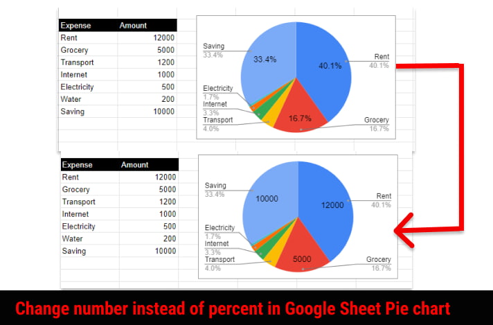
Here, In the example, we are using one simple table and generated pie charts showing data on expenses and savings of income. We assume that you already know to create a pie chart. And its default generated pie charts look like this.

This shows the only percentage in the piecharts and now you want to get value instead of this then follow these steps.
Working with Google Sheets version :
1 First click on the piechart
2 Click on 3 dots in the top right corner of the Pie Charts
3 Click on Edit Chart

4 Click on Customize panel
5 Expand the Pie chart section.
6 Under the slice label dropdown select 'value'

Now your pie chart looks like this.

Suppose you want both number and percent in a pie slice then just select "Value and Percentage" from the Slice label as shown below.

Suppose you have generated Pie Chart using Google Apps Script or by Insert > Chart then it will not display any label.
The script for Generating Pie Chart looks like this:
function createPieChart() {
var ss = SpreadsheetApp.getActiveSpreadsheet();
var sheet = ss.getSheets()[0];

var chart = sheet.newChart()
    .setChartType(Charts.ChartType.PIE)
    .addRange(sheet.getRange("F3:G10"))
    .setPosition(5, 20, 0, 0)
   .build();
 sheet.insertChart(chart);

 }
Note that F3:G10 is the value range and the setChartType() function accepts the type of the chart as a parameter. Here, we have mentioned Pie. And setPosition() will set the position of the chart and finally build() function is called which will build the piechart and then insertChart() function is called which binds the chart to the google sheet.
Just insert one line as shown below
Complete Google App Script looks like this:
function createPieChart() {
var ss = SpreadsheetApp.getActiveSpreadsheet();
var sheet = ss.getSheets()[0];

var chart = sheet.newChart()
    .setChartType(Charts.ChartType.PIE)
    .addRange(sheet.getRange("F3:G10"))
    .setOption('pieSliceText', 'value')
    .setPosition(5, 20, 0, 0)

    .build();

sheet.insertChart(chart);
 }
You can do the following to adjust the font size of numbers in pie chart labels:
Changing this label format will affect the readability and clarity of your piechart.
Conclusion:
In this article, we explain two approaches for converting piechart percentages to numbers; nevertheless, the first method, in which we set the "pieSliceText" option to "value," is the method that I find most useful. The second one is useful if you are generating Piechart using Google Script.


.png)


.jpg)